Contrast, Alignment, Repetition, and Proximity (CARP)
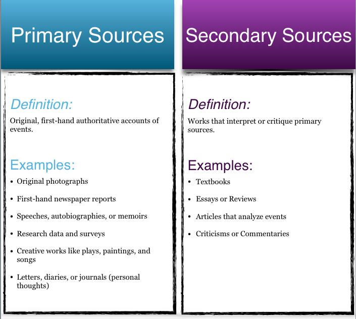
Contrast, alignment, repetition, and proximity play a vital role in instructional visuals. They are design actions because they require that you do something to one or more elements of a visual. In my project for this week, I was able to apply all 4 of these elements when showing the differences between primary and secondary sources of research.
Contrast: You create contrast by establishing a difference between elements in a visual. I typically think of contrast as opposites: light and dark, thick and thin, or large and small. I used contrasting colors for the two types of sources. All of my information relating to primary sources is in light blue, whereas information relating to secondary sources is in dark purple
Alignment: Lining things up along an edge or some type of imaginary line or path. Most important, in western cultures, is that text should be left-aligned for easier reading. An instructional benefit of alignment is the perception that aligned items are related, forming a perceptual chunk and reduce cognitive load. For my visual, I aligned a significant number of elements: Title, definitions, and the examples are aligned in their bulleted lists. Some of the examples for primary sources are multiple lines, so I rearranged the order to account for alignment of the bullets. All of the information pertaining to the specific source is also aligned left within each column for ease of reading.
Repetition: When using repetition, a designer will use an element of the visual again. Repetition can create a sense of harmony and unity and relationships. I was able to use repetition in my visual by using the same color in the corresponding column. With my headings using the same font and repeating the italicized 'Definition' in each column allows the similarities to be present. I used repeated boxes to set each source apart so there would be no confusion as to which set of information went with which source type. I also kept the shadowing of the headings and columns the same to provide consistency within the visual.
Proximity: Proximity involves moving visual elements closer together, seeming related, or farther apart, seeming unrelated, independent, or isolated. I wanted to keep the definitions of each source separate from the examples in my visual, setting apart of the aspects of the source. I decreased the font size in the line between the heading and it's subsequent information, meaning my font for the information I want you to read is 13 pt, whereas the font in the line between 'Definition' and the actual definition is only 6 pt.
Lohr, L.L. (2008). Creating graphics for learning and performance: Lessons in visual literacy. Upper Saddle River, NJ: Pearson Education.